
Recursive Flora
Making the experience of overthinking visible to those who live it, and legible to those who don’t
Objective
Explore how co-creation, personal data, and visual form can give shape to an experience that's usually both isolating and invisible.
my Role
Communication Design
Creative Direction
Data Visualization
Front-End Development & Interaction Design
User Research
tools
Figma
ChatGPT & Claude Code (Vibe-coding)
Adobe Creative Suite
HTML, CSS, Javascript
Hugging Face ML API
context
The more overthinkers explain, the less understood they feel
Overthinking is layered and emotionally charged, yet language often flattens it into “worry.” While many overthinkers seek support, repeated attempts to explain themselves can, over time, increase social friction (Nolen-Hoeksema & Davis, 1999).
Why this matters
With 73% of young adults reporting overthinking (Arbor, 2003), this creates a highly common, painful paradox: the more they communicate, the less understood they feel.
Who I designed for
Overthinkers looking for validation and a way to externalize their thought patterns without the pressure of "fixing" them; and
Non-overthinkers seeking to build genuine empathy and understand an otherwise invisible experience.
This project acts as a visual bridge between the two.
design challenge
How might design make deeply individual experiences collectively understood by everyone, not just those living it?
solution
Recursive Flora: Translating individual overthinking into a shared visual language
The project lives across two formats: a printed zine and an interactive website. A garden metaphor runs through both — individual experiences become flowers within a shared system, reframing overthinking as cyclical and natural rather than inherently negative.
Editorial publication: Recognition for some, education for others
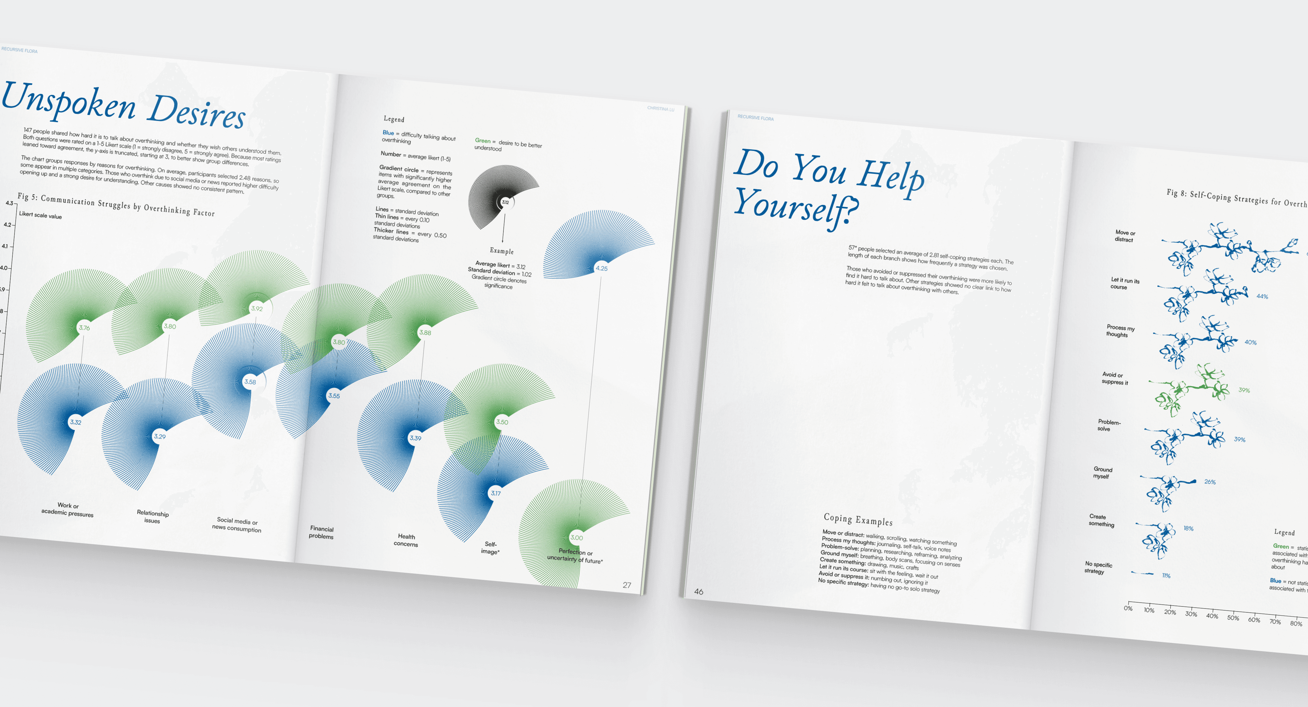
Visualizations of 152 survey responses that bridge data and art
Uses a cohesive graphic language to humanize data and show shared emotional experiences.
Helps readers recognize they’re not alone and understand overthinking through both logic and feeling.
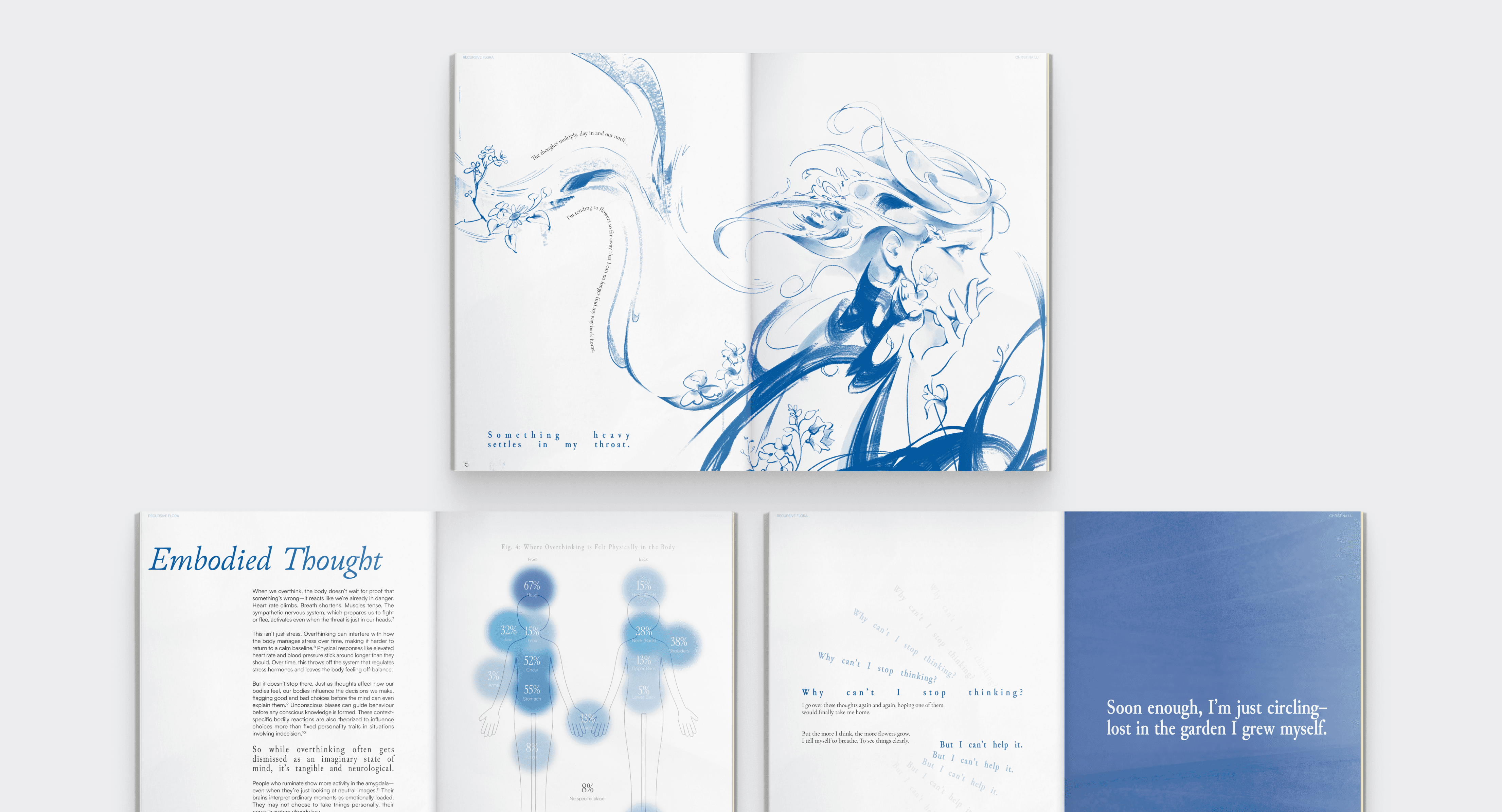
Narrative flow balancing literature review, written fiction, interview insights, and expressive layout
Alternates dense analytical spreads with empty layouts to mirror the rhythm of overthinking.
Combines academic analysis with illustration and personal storytelling to engage both emotional and logical perspectives.
Interactive website: A garden of quantified thought patterns
Explore different thematic categories of overthinking
Seven thematic categories allow focused exploration, while a shuffle mode supports casual discovery.
Overthinkers can use categories to find patterns and reflect on their experiences, while non-overthinkers can browse and build empathy.
See 73 user-generated metaphors broken down into 11 basic emotions
Each flower visualizes emotion through petal length (intensity, 0–100%) and color (positive/neutral/negative).
Fixed petal positions enable quick comparison across metaphors, making the emotional weight of overthinking legible even to those who don't experience it firsthand.
Animates fluidly across screen sizes
impact
From personal insight to shared understanding
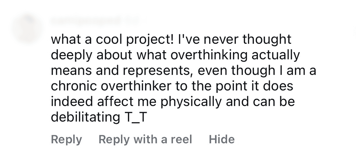
Recursive Flora reached over 7000 people organically and sparked meaningful conversations online and in person, affirming that an emotionally grounded, visually clear design can help make complex experiences easier to share.
7000+ organic views and 70+ comments, shares, saves
Many people shared that the project helped them finally put their experience with overthinking into words:
Presented to 60+ designers, engineers, founders
I debuted this project at Telos.Haus in New York, and it meant a lot when people came up afterward to say it reflected their own thought patterns and even helped them understand friends they’d never quite “gotten” before.
From then on, I presented the project at other design community events in New York and Vancouver where I also distributed copies of the zines in person.

publication process
Building trust through print: A zine that balances emotion with data and research
Letting research shape the form
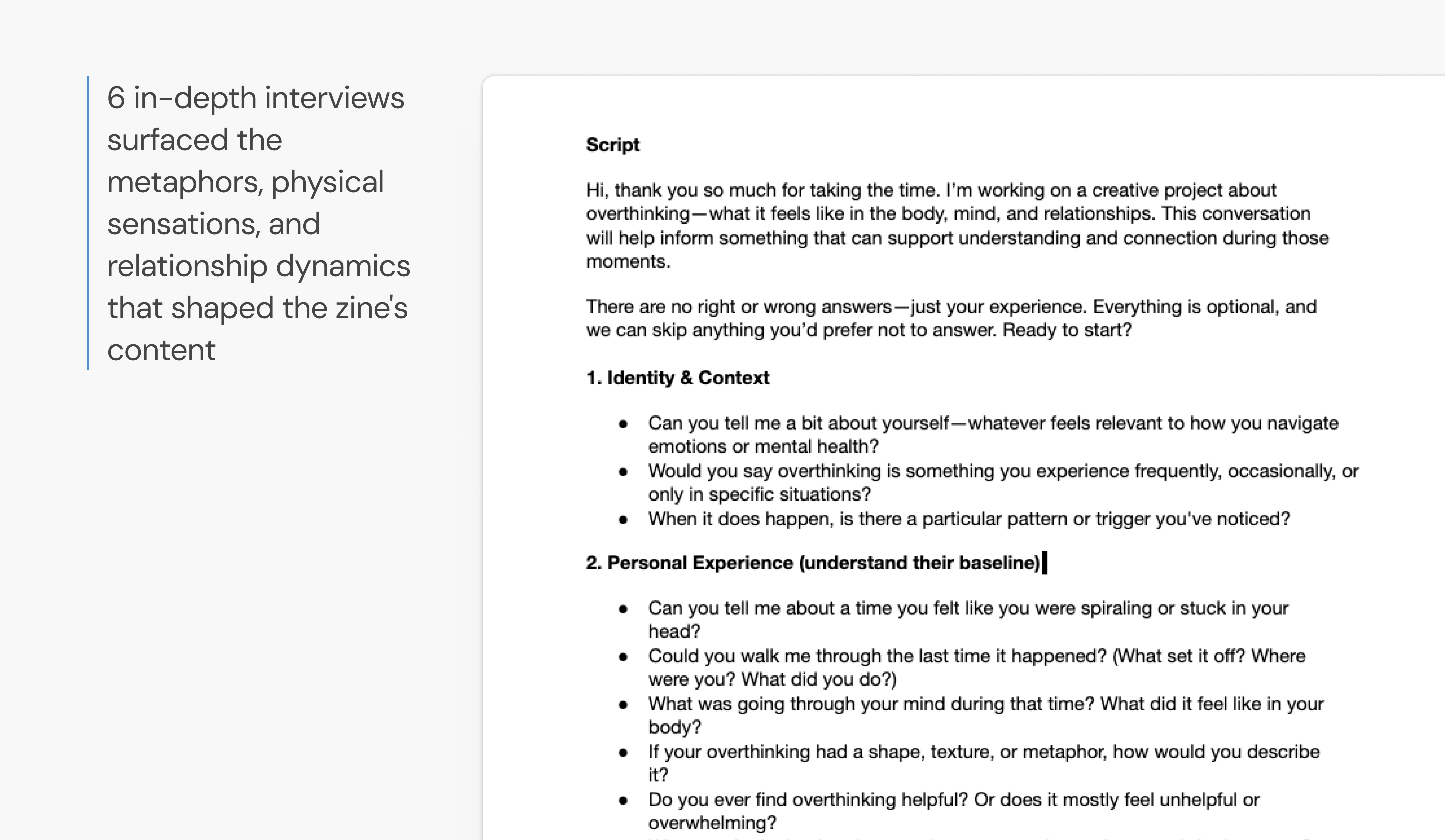
6 interviews shaped both the medium and the emotional tone
The interviews didn't just inform the content; they revealed that participants preferred an artifact over a tool and set the pacing and emotional register of the zine.
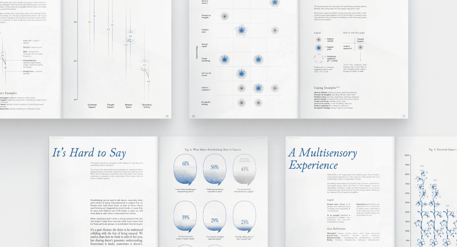
Surfacing co-occurring patterns in survey data
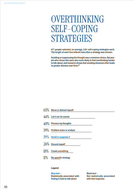
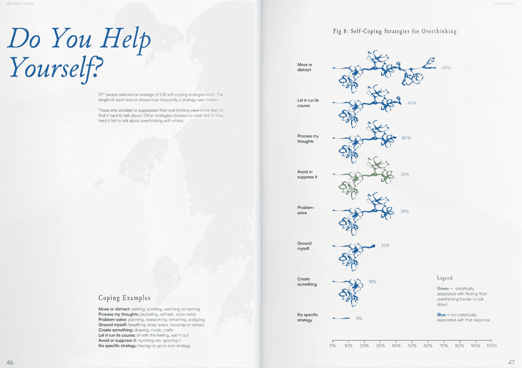
Created a robust survey on the overthinking experience and collected answers from 152 people (97% overthinkers).
I then used statistical analysis to find what the numbers couldn't say on their own: did people who felt X also tend to experience Y?
Grounding user narratives in academic research
Taking academic theory and applying it to interview and survey data made it more credible. Overthinkers can feel validated; non-overthinkers can intellectualize it and understand from another angle.

Insights from research that informed the overall design direction
Participants didn't want to be fixed; they wanted to feel understood. And I wasn't equipped to build something that could fix them anyway.
So instead of designing a therapeutic tool I wasn't qualified to make, I designed something for sharing: an artifact that says you're not alone in this and can be passed to someone else who might need to hear it. The zine's passivity became a feature, not a limitation — it makes no demands from its reader, but can still have impact (Anderson and Spandler, 2025).
Every experience is different
Design should avoid a single lens or “correct” narrative.
Overthinkers feel misunderstood
Design should help users feel recognized through shared experiences.
Sharing requires emotional labour
Design should build on existing stories rather than demand new vulnerability.
Structuring the narrative before designing
Legend of notes used to organize and plan publication content and story flow

Full storyboard with notes, references, and detailed plan for hi-fi design

Designing the thing!
Visual language that mirrors the experience
Linework, pacing, and composition were used to mirror shifts in cognitive intensity, from subdued thoughts to moments of visual overwhelm. The garden framing suggests that overthinking is cyclical and worth tending to, rather than a flaw to fix.
Hand-drawn illustrations and copywriting that inform but don't instruct

Transforming 'textbook-like' data visualization into art
I brought early drafts back to my initial participants, who were now acting as co-creators. While the copy and narrative pacing resonated, the initial data visualizations felt too rigid and sterile. They described it as “textbook-like,” creating a sense of duty to learn rather than curiosity to explore.
As an art direction choice, I realized overly prioritizing the function of data visualization couldn't support such vulnerable stories. Turning charts into standalone art pieces allowed the information to be felt, not just read, anchoring it deeply within the project's existing visual system.
Before example
After example
Spread of data visualizations post-feedback
Print as entry point, digital as depth
Most of the findings and insights are woven throughout the print, but one spread felt like it deserved more attention. A glimpse of participants' answers is included in the zine itself. The rest live on the accompanying website, accessible by scanning the QR code.
The print acts as the foundational artifact, with the full dataset online; read on to see why!

website process
Translating 73 user-generated metaphors into an interactive web experience
Why did I create a website to accompany the publication?
I asked participants: “If you could visualize your overthinking, what imagery comes to mind?” I expected similar answers, but instead, I got 73 wildly different metaphors, each carrying its own emotional weight. The responses were so vivid and sincere that narrowing them down to a curated few for the print felt like a loss. I felt that each response was worth exploring.
To make sense of it all, I used affinity diagramming to group responses into themes. These themes guided the visual system and interaction design for the website, and informed a key spread in the publication.
Affinity diagramming metaphor themes — seeing how differently people described the same feeling was one of my favourite parts of the process!

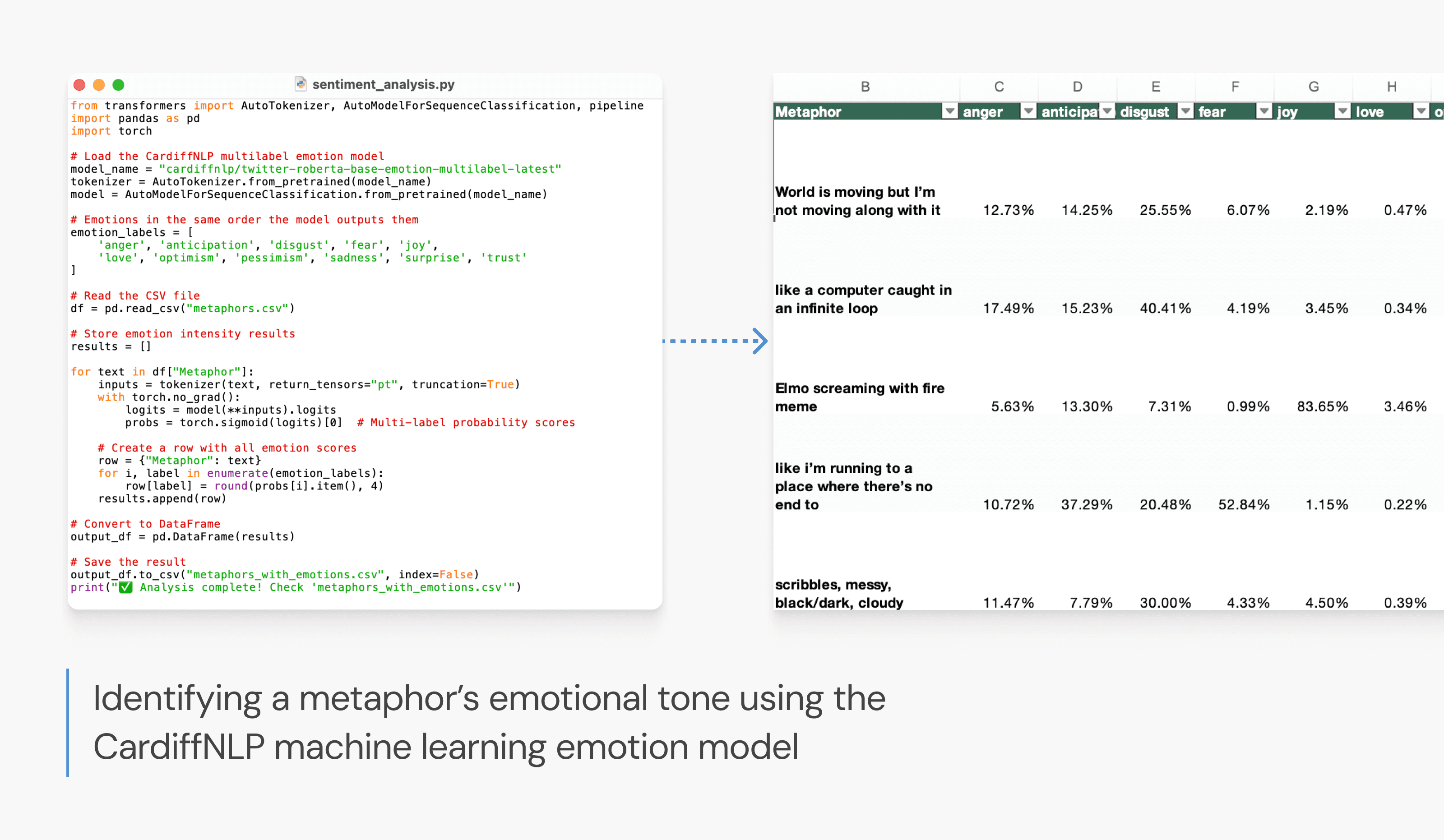
Using machine learning to transform abstract metaphors into measurable data
The metaphors revealed rich emotional patterns, and I wanted to translate these individual experiences into something that could ideally foster universal understanding.
I used machine learning to quantify each metaphor across 11 emotions, translating qualitative stories into structured data that could be explored and compared. I chose the TweetEval Emotion Multilabel (Cardiff NLP) model because it handles modern, expressive language — a good fit for how participants naturally wrote. While Barrett (2017) argues emotion categories are culturally constructed rather than universal, the model captures how metaphors register within a shared linguistic context, useful for pattern comparison, not emotional truth.
Analyzing metaphors’ emotional composition using the Cardiff NLP emotion model
Sketching with data: Which visual language would make emotion legible?
Building on the garden metaphor established earlier, I sketched multiple variations of the metaphor flower to explore how line, shape, and placement could express emotion while remaining legible.
Rough ideas for metaphor data visualization
Decision: Petal length as emotional intensity
Why? This design makes it easy to see the magnitude of emotions and compare them across flowers. The tradeoff is that some flowers may appear visually uneven, but clarity and interpretability were prioritized over aesthetic symmetry.
Lo-fi prototypes and user feedback: Users wanted a garden, not a grid
The sketches were translated into low-fidelity prototypes. I kept user testing very qualitative and lightweight because the final output would be more similar to a digital gallery than a functional tool. Emotional resonance was more important to me than pure utility.
Lo-fi prototypes tested for ease of navigation and overall 'joy factor'

Decision: Home page
Why? Users tested preferred this layout because it felt more lively and organic — like a garden of diverse flowers — while other lo-fi options felt boxed into grids. Functionally, it also made it easier to see how many metaphors belonged to each category.
Decision: Category page
Why? My design mentor preferred this layout for its clear link between metaphor text and visual form. Other drafts felt too disconnected or required excessive scrolling to view everything.
Hand-crafted hi-fi prototype
Although I planned to implement this design in code, creating and prototyping the design in Figma first allowed me to clearly envision, and later communicate, how it should look to Claude Code and ChatGPT, the AI coding platforms I chose.
Desktop hi-fi design and prototyping blueprint

Mobile hi-fi design and prototyping blueprint

Implementing and coding with AI
I began by creating a Product Requirements Document (PRD) to guide the build and communicated with Claude Code through the VS Code integration. My Figma file served as a handy reference to keep design and implementation aligned, and ChatGPT became a troubleshooter, too. The process taught me how crucial clear communication is when coding with AI, and how to troubleshoot creatively when things don’t go as planned.
Three ways I collaborated with AI
Be explicit about intent
I shared screenshots, prototypes, and code to clearly communicate visual goals, which sped up implementation.
Ask it to explain what’s happening
When things broke, I asked the AI to describe the issue in plain terms. This helped me build technical vocabulary and debug more effectively.
Use it as a learning companion
For new interactions, I asked for guided implementation, which led me to techniques like FLIP animations that I wouldn’t have discovered on my own.
Making the overthinking garden accessible with ARIA labels and colour contrast
I added ARIA labels for interactive controls (PDF navigation, mobile menu, and info tooltips) and improved colour contrast to meet WCAG AA standards using the WAVE web accessibility tool. All modal content - emotions, valence, intensity, and metaphor descriptions - is available as accessible text for screen readers.
The flower grid isn’t yet fully keyboard navigable. A future iteration would add full Tab/Enter support and semantic HTML patterns.
reflection
Designing for connection over cure: Looking beyond conventional solutions
Through this project, I learned that some experiences call for a different kind of design response. Many wished they could “turn off” their thoughts, yet recognized that overthinking is part of how they process the world. What they really needed wasn't a cure, but understanding and connection. The solution was to externalize overthinking, transforming the collective experiences of over 100 people into a shared, multi-modal visual language that still preserved individual uniqueness.
This reframed my approach to problem-solving: sometimes the goal isn't to change behaviour or drive action, but to design spaces that make it easier to reflect, connect, and feel understood.
what's next
What's next for Recursive Flora?
Independent publishing & physical distribution
Following a small initial pilot with designers in New York and Vancouver, I am planning future print editions to formally expand the project's physical footprint.
Accessibility improvements
The current version meets baseline accessibility standards for contrast and ARIA labelling, but I want to explore more inclusive patterns, edge cases, and assistive-tech testing.
Multi-sensory garden features
Looking ahead, I hope to revisit several conceptual features to create a richer, multi-sensory “garden”:
DIY Flower Builder → users contribute metaphors (requires moderation + privacy design)
Haptics / Audio Flourishes → engaging beyond the visual sense